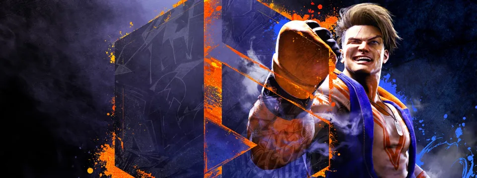
The Evolution of the Street Fighter 6 Logo Design Explained
Discover the design history behind the Street Fighter 6 logo. Learn how Capcom transitioned from placeholder concepts to the final, iconic branding.
Published: Street Fighter 6 Wiki Editorial Team
Video Guide
About That Street Fighter 6 Logo…Table of Contents
The journey of the Street Fighter 6 logo is more than just a story about graphic design; it is a fascinating case study in how modern game developers listen to community feedback. As one of the most anticipated fighting games, the branding of Street Fighter 6 had to perfectly capture the franchise's legacy while signaling a bold, new future for the series.
Understanding the visual identity of a game is crucial for fans who appreciate the aesthetic direction of their favorite titles. In this guide, we explore why the final design works, how it evolved through development, and why it stands as a masterclass in modern gaming branding.
The Evolution of the Street Fighter 6 Logo
When the first teasers for the game emerged, the community was quick to scrutinize every detail. The path from the initial reveal to the final product was fraught with controversy, particularly regarding the logo. For many fans, the logo is the first point of contact with a game's soul, and Capcom’s initial attempts fell short of expectations.
Chronology of Logo Development
Based on community records and design history, the project went through three distinct phases before settling on the branding we recognize today.
Phase
Timeframe
Status
Key Characteristics
Interim
2020–2022
Teaser
Flaming "6" with Ryu’s arm visible.
Placeholder
Feb 2022
Rejected
Hexagonal, criticized for stock-like design.
Final
June 2022–Present
Official
Urban "SF6 College" font, bold structure.
As noted by design enthusiasts, the transition from the "placeholder" logo to the final version was a direct response to internet backlash. The initial 2022 design was widely criticized for its resemblance to Adobe Stock assets, prompting Capcom to pivot toward a more original, expressive identity.
Why the Final Design Succeeds
The final Street Fighter 6 logo is widely considered a massive upgrade. It avoids the cluttered look of its predecessors and utilizes a custom typeface, "SF6 College," which leans heavily into the game’s urban, hip-hop-inspired culture.
Design Elements Comparison
Feature
Old/Placeholder Logo
Final Logo
Typography
Generic Sans-Serif
Custom "SF6 College"
Visual Impact
Static and disconnected
Bold and kinetic
Cultural Fit
Lacked specific identity
Aligns with urban aesthetic
The incorporation of the Roman numeral "6" is the standout achievement here. While previous logos often struggled to balance the "Street Fighter" text with the number, the final design uses the "6" as an anchor. It doesn't compete with the title; it complements it.
The Role of Community Feedback
The power of the gaming community cannot be overstated. In the case of the Street Fighter 6 logo, the backlash provided a "fire under Capcom's ass," as noted in various community reports. This feedback loop ensured that the final design was not just a branding exercise, but a piece of art that reflected the high-energy, competitive nature of the game.
Tip
Design Appreciation: When analyzing game logos, look for how the font weight interacts with the background. A bold, thick font like the one in SF6 is designed to be readable even on small mobile screens or busy streaming thumbnails.
Technical Context and Platform Availability
While the logo represents the game's identity, the experience is defined by the gameplay itself. As confirmed by the official Steam store page, the game is fully optimized for modern hardware. Players looking to dive into the action should ensure they are accessing the full game rather than the demo, as the demo (AppID 2154900) is intended for testing specific mechanics and does not contain the complete feature set of the full release.
Comparison: Demo vs. Full Game
Feature
Demo (AppID 2154900)
Full Game (AppID 1364780)
Content
Select modes/characters
Complete roster/campaign
Usage
Trial/Performance test
Full experience
Updates
Limited
Ongoing support
Common Questions (FAQ)
Is the Street Fighter 6 logo the same across all regions?
Yes, the current branding is the global standard for the game. The "SF6 College" font and the bold "6" emblem are used consistently across all marketing and in-game assets.
Why was there so much controversy over the logo?
The controversy stemmed from the 2022 placeholder logo, which many fans felt was uninspired and shared similarities with generic stock imagery. The final Street Fighter 6 logo was created to resolve these concerns and better represent the game's unique urban style.
Can I find the logo files on the Steam store?
The Steam store page for the game features the official logo prominently in the header and assets. However, always refer to the official press kits from Capcom if you are looking for high-resolution vector files for creative projects.
How does the logo affect the game's brand identity?
The logo serves as a visual shortcut for the game’s "hip-hop" and "urban" design philosophy. By choosing a bold, aggressive typeface, the developers successfully signaled that this entry in the series would be faster, sharper, and more modern than previous iterations.